The Altame Superfamily
“It's sort of my digital Handwriting!” —Moritz
Altame is a comprehensive TypeFace Family originally designed for blogs,
and developed into an extensive learning experience.
Altame currently has no distribution channel, if you would like a copy, or if
you would like further information,
please send an email to sayhi ( at ) zimmermail.net.
The Altame Name
u
The name Altame didn't come out of nowhere, and here is a
little history of the name:
The first version of the TypeFace was called “Zettwiezimmer”. After many
revisions, it eventually ended up something like
“Zettwiezimmer Alternate”. Since names like
“Zettwiezimmer Zwei Alternate Regular Bold” are not
exactly catchy, or functional, I shortened it “Alt” for development purposes.
I noticed a lot of premium TypeFace on the web use the ending
“Pro”, so I played with the thought for a while to
name the TypeFace “Alt Pro”. Since this was (and isn't) nowhere near
a Pro Font, I thought maybe “Alt Amateur”
would be an appropriate name. Hence: Altama came to mind.
An Internet search destroyed that name though: I have and wish no association with the company
that operates under that name. Plus showing it to a few people, everyone seemed
to always want to read “Alabama”, also not something I am associated with.
And so the last step was to play with the vowels until I had something that sounded
cool, was unique and looked nice. Since my favourite letters are the lowercase
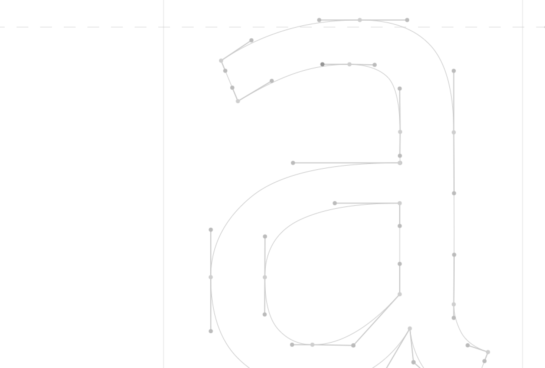
“a” and “e”, and
they very much define the feel of the TypeFace, what could be more perfect than:
“Altame”
